
Images can make or break your website's SEO. They grab attention, explain complex ideas, and keep visitors engaged. But if they're not optimized properly, they'll tank your page speed, hurt your search rankings, and frustrate your users. In this guide, we'll cover everything you need to know about serving images the right way — from choosing the correct format to implementing responsive images and lazy loading.
Why Image Optimization Matters for SEO
Google has made it clear: page speed is a ranking factor. And images are often the biggest culprit behind slow-loading pages. According to HTTP Archive data, images account for roughly 50% of the average webpage's total weight. That's a massive chunk of data that directly affects how fast your site loads.
Here's why this matters for SEO:
-
Core Web Vitals: Google's Core Web Vitals measure real-world user experience. The Largest Contentful Paint (LCP) metric often depends on how quickly your hero image or main content image loads. A slow LCP means a lower score, which can hurt your rankings.
-
Mobile-First Indexing: Google predominantly uses the mobile version of your site for ranking. Mobile users often have slower connections, making image optimization even more critical.
-
Bounce Rates: Visitors don't wait around. If your page takes more than 3 seconds to load, a significant portion of users will leave before seeing your content. Optimized images help keep them engaged.
-
Crawl Budget: Search engine bots have limited time to crawl your site. Large, unoptimized images waste that budget on downloading bytes instead of discovering content.
Prerequisites
Before diving in, here's what you should have:
- Basic HTML knowledge: You should understand tags like
<img>and attributes likesrcandalt. - Access to your website files: Either through FTP, a CMS like WordPress, or direct server access.
- A text editor: For editing HTML and configuration files.
For some advanced techniques, command-line familiarity helps, but it's not required. We'll provide GUI alternatives where possible.
Choosing the Right Image Format
Not all image formats are created equal. Picking the right one can dramatically reduce file size without sacrificing quality.
JPEG (JPG)
Best for: Photographs and images with many colors and gradients.
JPEG uses lossy compression, meaning it discards some image data to reduce file size. For photos, this trade-off is usually invisible to the human eye. Use JPEG when:
- You're displaying photographs
- The image has smooth color transitions
- You don't need transparency
PNG
Best for: Graphics with transparency, screenshots, images with text.
PNG uses lossless compression, preserving all image data. Files tend to be larger than JPEG, but you get:
- Full transparency support (alpha channel)
- Crisp edges on text and graphics
- No quality loss from repeated saves
Use PNG for logos with transparent backgrounds, screenshots, or any image where crispness matters more than file size.
WebP
Best for: Almost everything on the modern web.
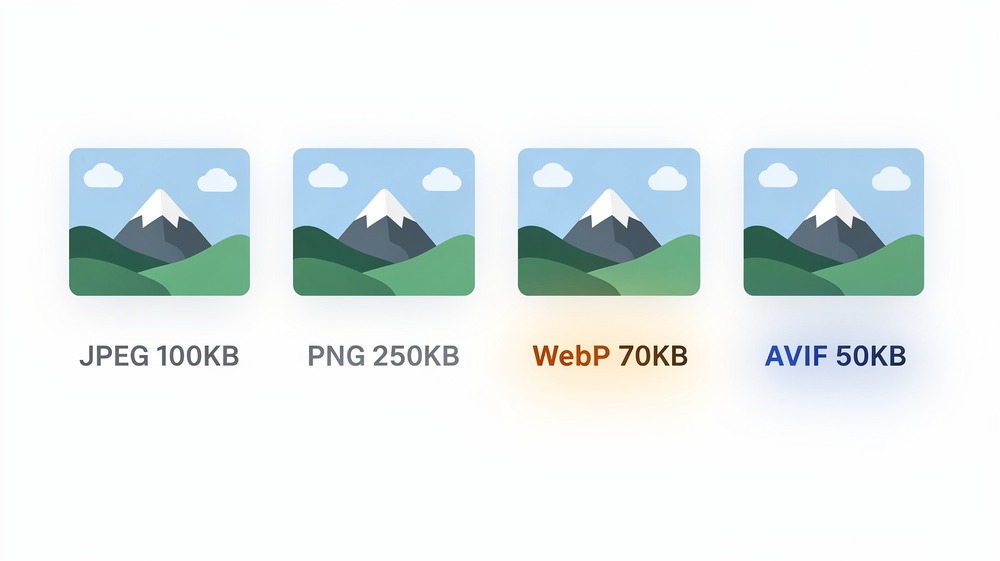
WebP is Google's image format, and it delivers the best of both worlds — lossy compression like JPEG and transparency like PNG, but with significantly smaller file sizes. WebP images are typically 25-35% smaller than equivalent JPEG files.
Browser support is now excellent. As of 2024, WebP works in Chrome, Firefox, Safari, Edge, and all major mobile browsers. There's really no reason not to use it as your primary format, with JPEG/PNG fallbacks for the rare older browser.
AVIF
Best for: Maximum compression when browser support allows.
AVIF is the newest format, offering even better compression than WebP — often 50% smaller than JPEG at similar quality. However, browser support is still catching up. Safari added support in late 2023, and older browsers don't support it at all.
Use AVIF as a progressive enhancement with WebP and JPEG fallbacks. We'll show you how to implement this with the <picture> element later.
SVG
Best for: Logos, icons, simple illustrations.
SVG is a vector format, meaning it scales to any size without losing quality. It's perfect for:
- Company logos
- Icons
- Simple illustrations with flat colors
- Animated graphics
SVGs are also text-based (XML), so they're tiny for simple graphics and can be styled with CSS.
Quick Format Decision Guide
Ask yourself these questions:
- Is it a logo or icon? → SVG
- Does it need transparency? → PNG (or WebP)
- Is it a photograph? → WebP with JPEG fallback
- Do you want maximum compression? → AVIF with WebP and JPEG fallbacks
Compressing Your Images
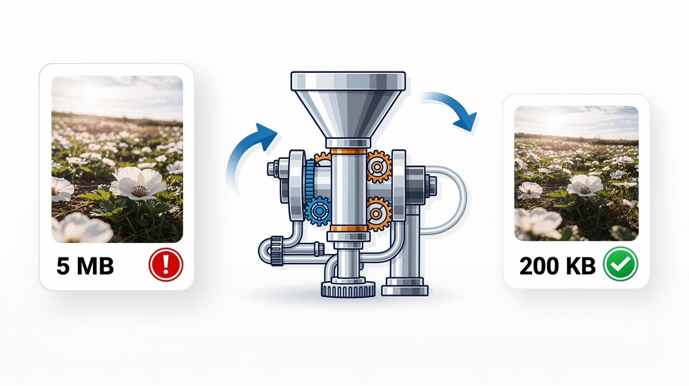
Even after choosing the right format, you still need to compress your images. An uncompressed 4000x3000 pixel photo straight from a camera can be 10-15 MB. After proper compression, that same image might be 200-400 KB — a 95% reduction.
Lossy vs Lossless Compression
Lossy compression permanently removes some image data to achieve smaller files. The key is finding the sweet spot where file size drops significantly but quality remains acceptable. For most web images, a JPEG quality setting of 80-85% produces excellent results with minimal visible degradation.
Lossless compression removes redundant data without affecting image quality. The file size reduction is smaller, but you retain full fidelity. Use this for PNG graphics where every pixel matters.
Recommended Tools
For quick, one-off compression:
-
Squoosh — Google's free web-based tool. Drag and drop an image, adjust quality, compare before/after, and download. Supports all modern formats.
-
TinyPNG — Despite the name, it handles both PNG and JPEG. Simple drag-and-drop interface with excellent results.
For batch processing (GUI):
-
ImageOptim (Mac) — Drop a folder of images and it optimizes them in place. Free and fast.
-
FileOptimizer (Windows) — Similar functionality for Windows users.
For automation (command line):
If you're comfortable with the terminal, these tools let you automate compression in build scripts:
# Convert JPEG to WebP using cwebp (Google's tool)
cwebp -q 80 input.jpg -o output.webp

# Compress JPEG with mozjpeg
cjpeg -quality 85 input.jpg > output.jpg

# Batch convert all JPEGs in a folder to WebP
for file in *.jpg; do cwebp -q 80 "$file" -o "${file%.jpg}.webp"; done
To install these tools:
# macOS (using Homebrew)
brew install webp mozjpeg

# Ubuntu/Debian
sudo apt install webp
Quality Settings Recommendations
| Format | Recommended Quality | Notes |
|---|---|---|
| JPEG | 80-85% | Lower than 75% often shows visible artifacts |
| WebP | 75-85% | More efficient than JPEG at same quality level |
| PNG | Lossless | Use tools that optimize without quality loss |
| AVIF | 60-80% | Very efficient; lower numbers still look good |
Responsive Images with srcset and sizes
Your visitors use everything from 4K monitors to budget smartphones. Serving the same massive image to all of them wastes bandwidth and slows down mobile users. Responsive images solve this by letting browsers choose the most appropriate image size.
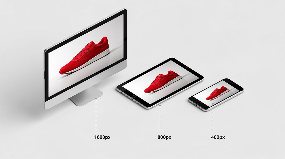
The srcset Attribute
The srcset attribute provides a list of image sources with their widths. The browser then picks the best one based on the viewport size and screen density.
<img
  src="product-800.jpg"
  srcset="
    product-400.jpg 400w,
    product-800.jpg 800w,
    product-1200.jpg 1200w,
    product-1600.jpg 1600w
  "
  alt="Red running shoes on white background"
>
The w descriptor tells the browser the actual width of each image file in pixels. The browser uses this information along with the viewport width and pixel density to select the right image.
The sizes Attribute
While srcset tells the browser what's available, sizes tells it how big the image will be displayed. This helps the browser make a smarter choice before the CSS has even loaded.
<img
  src="product-800.jpg"
  srcset="
    product-400.jpg 400w,
    product-800.jpg 800w,
    product-1200.jpg 1200w,
    product-1600.jpg 1600w
  "
  sizes="(max-width: 600px) 100vw, (max-width: 1200px) 50vw, 800px"
  alt="Red running shoes on white background"
>
This sizes attribute says:
- On screens up to 600px wide, the image takes 100% of the viewport width (
100vw) - On screens 601-1200px wide, the image takes 50% of the viewport width (
50vw) - On larger screens, the image is displayed at 800 pixels wide
The Picture Element for Format Fallbacks
The <picture> element lets you serve modern formats with fallbacks for older browsers:
<picture>
  <!-- AVIF for browsers that support it -->
  <source
    type="image/avif"
    srcset="
      product-400.avif 400w,
      product-800.avif 800w,
      product-1200.avif 1200w
    "
    sizes="(max-width: 600px) 100vw, 50vw"
  >

  <!-- WebP as second choice -->
  <source
    type="image/webp"
    srcset="
      product-400.webp 400w,
      product-800.webp 800w,
      product-1200.webp 1200w
    "
    sizes="(max-width: 600px) 100vw, 50vw"
  >

  <!-- JPEG fallback for older browsers -->
  <img
    src="product-800.jpg"
    srcset="
      product-400.jpg 400w,
      product-800.jpg 800w,
      product-1200.jpg 1200w
    "
    sizes="(max-width: 600px) 100vw, 50vw"
    alt="Red running shoes on white background"
    loading="lazy"
    width="800"
    height="600"
  >
</picture>
The browser evaluates sources from top to bottom and uses the first one it supports. Every browser understands the <img> fallback at the end.
Lazy Loading Images
Lazy loading delays loading images until they're about to enter the viewport. This means visitors don't download images they might never scroll to, significantly speeding up initial page load.
Native Lazy Loading
Modern browsers support native lazy loading with a simple attribute:
<img
  src="product.jpg"
  alt="Product description"
  loading="lazy"
  width="800"
  height="600"
>
That's it. No JavaScript required. The browser handles everything automatically.
When to Use Lazy Loading
Use loading="lazy" for:
- Images below the fold (not visible on initial load)
- Images in long scrolling pages
- Gallery or grid layouts
Don't use lazy loading for:
- Hero images or above-the-fold content
- Images critical to the initial user experience
- The LCP (Largest Contentful Paint) element
For above-the-fold images, either omit the loading attribute or explicitly set loading="eager":
<!-- Hero image - loads immediately -->
<img
  src="hero.jpg"
  alt="Welcome to our site"
  loading="eager"
  width="1200"
  height="600"
>

<!-- Product grid below the fold - loads lazily -->
<img
  src="product-1.jpg"
  alt="Product one"
  loading="lazy"
  width="400"
  height="400"
>
Browser Support
Native lazy loading is supported in all modern browsers including Chrome, Firefox, Safari, and Edge. For the rare older browser that doesn't support it, the attribute is simply ignored and images load normally.
Specifying Dimensions to Prevent Layout Shift
Have you ever visited a page where the content jumps around as images load? That's called Cumulative Layout Shift (CLS), and it's one of Google's Core Web Vitals. It's also incredibly annoying for users.
The fix is simple: always specify width and height attributes on your images.
<!-- Good: dimensions specified -->
<img
  src="photo.jpg"
  alt="A sunset over the ocean"
  width="800"
  height="600"
>

<!-- Bad: dimensions missing -->
<img
  src="photo.jpg"
  alt="A sunset over the ocean"
>
When you provide dimensions, the browser reserves the correct amount of space before the image loads. No jumping, no layout shift.
Modern CSS for Responsive Dimensions
With dimensions specified, you can still make images responsive with CSS:
img {
  max-width: 100%;
  height: auto;
}
This CSS tells images to scale down on smaller screens while maintaining their aspect ratio. The width and height attributes still prevent layout shift because browsers calculate the aspect ratio from them.
Writing Effective Alt Text
The alt attribute serves two critical purposes: accessibility for screen reader users, and context for search engines. Good alt text improves both SEO and user experience.
What Makes Good Alt Text
Good alt text is:
- Descriptive: Explains what the image shows
- Concise: Usually 125 characters or less
- Contextual: Relates to the surrounding content
- Natural: Reads like a normal sentence
Examples: Good vs Bad Alt Text
Bad:
<img src="shoes.jpg" alt="shoes">
<img src="shoes.jpg" alt="red shoes running shoes buy shoes online cheap">
<img src="shoes.jpg" alt="IMG_4521.jpg">
Good:
<img src="shoes.jpg" alt="Red Nike running shoes on a white background">
The bad examples are either too vague, stuffed with keywords (which search engines penalize), or completely useless.
When to Use Empty Alt Text
Some images are purely decorative and add no meaningful content. For these, use an empty alt attribute:
<!-- Decorative flourish -->
<img src="decorative-border.png" alt="">

<!-- Icon next to text that already says the same thing -->
<button>
  <img src="search-icon.svg" alt="">
  Search
</button>
An empty alt="" tells screen readers to skip the image entirely. Omitting the alt attribute altogether is bad practice and will trigger accessibility warnings.
File Naming and URL Structure
Search engines can't "see" images the way humans do. They rely on file names and surrounding context to understand what an image depicts.
Use Descriptive File Names
Rename your images before uploading them:
# Bad
IMG_4521.jpg
DSC0001.jpg
photo1.jpg

# Good
red-nike-running-shoes.jpg
golden-gate-bridge-sunset.jpg
homemade-sourdough-bread.jpg
Descriptive file names help search engines understand your images and can help them appear in Google Image search results.
Naming Conventions
-
Use hyphens, not underscores: Google treats hyphens as word separators but underscores as word joiners.
running-shoes.jpgis read as "running shoes" whilerunning_shoes.jpgmight be read as "runningshoes". -
Keep it lowercase: Avoids potential URL issues on case-sensitive servers.
-
Be specific but concise:
blue-widget-product-photo.jpgis better thanwidget.jpgorblue-plastic-widget-model-xyz-123-product-photo-front-view.jpg.
Image Sitemaps
If images are important to your site (e-commerce, photography, design portfolios), consider creating an image sitemap. This helps search engines discover images that might be loaded via JavaScript or are embedded in ways that are hard to crawl.
Basic Image Sitemap Structure
<?xml version="1.0" encoding="UTF-8"?>
<urlset xmlns="http://www.sitemaps.org/schemas/sitemap/0.9"
        xmlns:image="http://www.google.com/schemas/sitemap-image/1.1">
  <url>
    <loc>https://example.com/products/running-shoes</loc>
    <image:image>
      <image:loc>https://example.com/images/red-running-shoes.jpg</image:loc>
      <image:title>Red Running Shoes</image:title>
    </image:image>
    <image:image>
      <image:loc>https://example.com/images/red-running-shoes-side.jpg</image:loc>
      <image:title>Red Running Shoes Side View</image:title>
    </image:image>
  </url>
</urlset>
You can include up to 1,000 images per page in your sitemap. Submit your sitemap through Google Search Console to ensure Google knows about it.
CDN and Caching
A Content Delivery Network (CDN) stores copies of your images on servers around the world. When someone visits your site, they download images from the nearest server, dramatically reducing load times.

Benefits of Using a CDN
- Faster load times: Images served from geographically close servers
- Reduced server load: Your origin server handles less traffic
- Automatic optimization: Many CDNs can resize and convert images on the fly
- Better uptime: If one server fails, others take over
Popular CDN Options
- Cloudflare: Free tier available, excellent performance, automatic WebP conversion
- Bunny CDN: Very affordable, pay-as-you-go pricing, fast global network
- Amazon CloudFront: Integrates well with AWS services
- Imgix / Cloudinary: Specialized image CDNs with on-the-fly resizing and optimization
Cache Headers
Configure your server to cache images for a long time. Images rarely change, so there's no need for browsers to re-download them on every visit.
For Apache, add to your .htaccess:
<IfModule mod_expires.c>
  ExpiresActive On
  ExpiresByType image/jpeg "access plus 1 year"
  ExpiresByType image/png "access plus 1 year"
  ExpiresByType image/webp "access plus 1 year"
  ExpiresByType image/avif "access plus 1 year"
  ExpiresByType image/svg+xml "access plus 1 year"
</IfModule>
For Nginx, add to your server block:
location ~* \.(jpg|jpeg|png|gif|webp|avif|svg|ico)$ {
    expires 1y;
    add_header Cache-Control "public, immutable";
}
The immutable directive tells browsers that the file will never change, preventing unnecessary revalidation requests.
Common Mistakes and How to Avoid Them
Uploading Uncompressed Images
Never upload images directly from your camera or phone without compression. A 12-megapixel photo can easily be 5-10 MB. Compress every image before uploading.
Missing Alt Text
Every informational image needs alt text. It's essential for accessibility and helps SEO. The only exception is purely decorative images, which should have alt="".
Not Providing Fallbacks for Modern Formats
If you serve WebP or AVIF without fallbacks, older browsers will show broken images. Always use the <picture> element to provide format alternatives.
Ignoring Mobile Users
Half your visitors are probably on mobile. Test your images on actual mobile devices and slow connections. Chrome DevTools can simulate slow 3G to show how your images load for users with poor connectivity.
Using CSS Background Images for Important Content
Search engines might not index CSS background images, and screen readers skip them entirely. If an image conveys meaning, use an <img> tag.
Forgetting Dimensions
Omitting width and height attributes causes layout shift, hurting your CLS score. Always specify dimensions, even for responsive images.
Quick Checklist
Before publishing any page, run through this checklist:
Format & Compression:
- Images are in the right format (WebP with fallbacks)
- All images are compressed (aim for under 200 KB for most images)
- Large photos are resized to reasonable dimensions (rarely need more than 2000px wide)
HTML Attributes:
- All images have descriptive
alttext (oralt=""for decorative images) - All images have
widthandheightattributes - Below-the-fold images use
loading="lazy"
Responsive Images:
- Multiple sizes provided via
srcsetfor key images -
sizesattribute accurately describes layout -
<picture>element used for format fallbacks
Performance:
- Hero/LCP image loads eagerly (no lazy loading)
- Images are served from a CDN (if possible)
- Cache headers are configured for long expiration
Conclusion
Image optimization isn't glamorous, but it has a real impact on your search rankings and user experience. The techniques in this guide — choosing the right format, compressing properly, using responsive images, lazy loading, and writing good alt text — form the foundation of modern web performance.
Start with the basics: compress your images and add proper alt text. Then progressively enhance with WebP, responsive images, and lazy loading. Each improvement compounds, leading to faster pages, happier users, and better search rankings.
The best part? Most of these optimizations are set-and-forget. Once you establish a workflow for handling images, it becomes automatic. Your future self (and your visitors) will thank you.
Explore more tutorials to continue improving your technical SEO and web performance skills.